outreach
Live CV
11/07/14 16:28
| Just a note that I’ve decided the CV is dead. A bunch of pieces of paper stapled together, a big list of mostly irrelevant information to your needs. If you want to decide what my impact as a scientist is, it has nothing to do with the names of journals I have published in. It really doesn’t matter what university I’m at - or if I’m at a university at all. If I’m able to sell my ideas, I get grants. That funding helps me travel, collect data, support students. Those efforts let me answer questions. If my answers are useful, people will refer to those publications and data sets and continue the march of science. As such, you don’t need a few pieces of paper stapled together to sift through. I have started my | Live CV page, which you click on and can see the progress of my publications. I will work on adding a location that summarizes my funding sources.
Representation
19/02/14 12:04
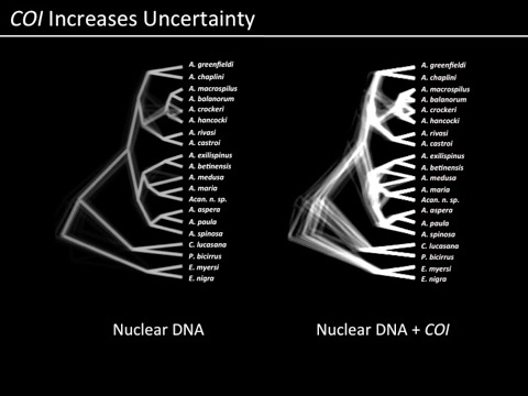
When I first started doing science, visualization of our data and results was a bit easier. Sequence a gene from 20-30 individuals, generate a phylogenetic hypothesis, make it look pretty, Figure 1. As we have moved to information from more and more loci (or greater numbers of samples, or any other factor of additional complexity), there have been ways developed to summarize the results visually for the purposes of proving to the audience of a journal article that you are on the right track in terms of interpretation. For example, former postdoc (and now faculty at Texas A&M - Galveston) Ron Eytan used these images to show which parts of a phylogeny were consistently supported and which were not (an image that overlays many reconstructions of a phylogeny from the same data):
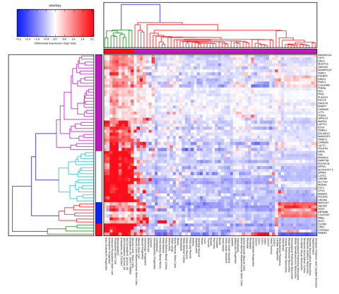
and we are now becoming familiar with things like transcriptome heat maps to illustrate over/under expression of particular genes:
and to an extent, we have just become accustomed to more complicated representations of data and results residing only as online supplemental files. In other words, often the most important components of science are no longer able to be represented in the standard peer-reviewed journal article. We are at this point often having to take into consideration representation of science through multiple filters: how will it communicate to the audience? what if that audience is looking only at a photocopy, or black-and-white print of my article? what if that audience is unable to afford the journal I submit to?
but what I’m grappling with today, is what if there is no single view, even if it is a figure with multiple panels, that can explain your results the same way that having an animation, in particular an interactive animation, could do?
the above is a representation of fitting in silico particles (representing barnacle larvae) to a coastal oceanographic system with environmental selection on the two lineages of barnacle that we are studying. The bottom plot shows frequencies of the northern and southern types plotted against latitude, and as the movie plays it shows how the oceanography and selection interact to fit simulated data to empirical data. This alone is a daunting amount of information. But we can vary so many parameters: depth of larval release, time in the water column, strength of selection, cost functions, the fit to over 100 distinct loci for which we have data, inter annual variation. There is almost no way to represent the complexity of this story - adequately! - in the illustrations we typically put together for a science publication. So it will probably end up that many of these movies will be online supplements. But I wonder: when will our expectations of “publishing” science catch up with the technology with which we DO science?
Explanations
01/02/13 09:36
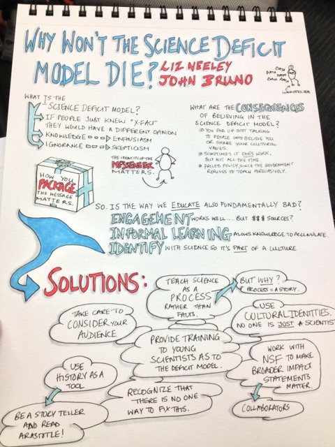
I saw this post from John Bruno (from the Science Online meeting) yesterday and had to share it. There is no reason we should still be having the same discussions over and over and over and over and over. It is clear that just spouting data at people does not work to educate them; as educators, and communicators, we have to figure out better how to resonate with people.
Wiki This Part Two
05/12/12 18:06
As has been mentioned before, I really really love wikis. The collective information of many thousands of people with just enough extra time on their hands! Why, just today I was sending a link about the spanish word manzano (apple tree) to my little boy, and that link led me to a Wikipedia link to the Manzano mountains in New Mexico, where I used to live so I followed a link there to the Sandia mountains just north of the Manzanos and came to this picture:
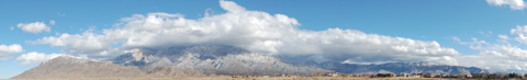
(the giant version is much better) and, reading more about the mountains I loved to hike and bike in when I lived there, I find out this astonishing fact: it is an uplifted coral reef, probably!
And so the amount we can learn when we are all communicating is pretty fantastic. My students in GENE 3000H (Honors Evolution) just finished their website on the interface between climate change and evolutionary processes, and it is really impressive to me how much they accomplished. This started a conversation among the folks in my lab about things like Wikipedia - traditionally, the bane of professors grading undergraduate research papers - being considered a component of scientific outreach. So my student Christine posts this page on turtle barnacles, starting from scratch. Katie was updating the page on Unionid mussels today. We are thinking this will be part of our weekly lab group, when we catch up with what each of us have been doing we’ll discuss the topics we have added to, and learned from. Obviously, Wikipedia is generally only the starting point for inquiry, but why not make it as complete as possible? Similar tools like the Encyclopedia of Life are also great things to contribute to (I haven’t tried this yet - next step!).
Outreach 2
03/05/11 11:38
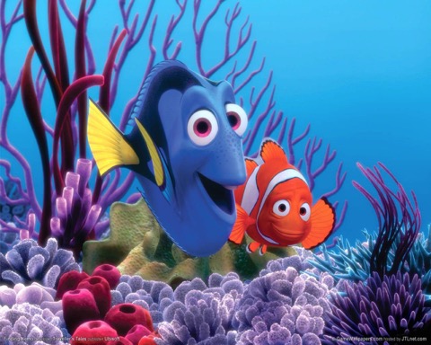
Wow. Today I went to Fowler Drive Elementary and met with the 4th graders, after being invited by teacher Frannie Gay. I brought some slides to show on my iPad (today’s fourth-grade classrooms are SO cool compared to the dreary situation I went through 30 years ago; they have integrated LCD projectors with a projection screen that doubles as touch-pad) and the kids must have asked me 100 questions about corals, sharks, bacteria, washing hands, Finding Nemo, and dirty water. Mission accomplished.
Faculty from UGA do this each spring as part of our “LemonAid” program, started a couple years ago when we were being furloughed thanks to lousy budgets. When life gives you lemons, get it? So on furlough days faculty would go to local schools; this year, no furloughs but it seems a good tradition to keep up. And, it gives me one of those extremely rare opportunities to not just claim to be a marine biologist, but actually feel like I’m doing something that might change something for the better on this world. Maybe one of those kids will get the overall message about clean water and take it to heart.
Faculty from UGA do this each spring as part of our “LemonAid” program, started a couple years ago when we were being furloughed thanks to lousy budgets. When life gives you lemons, get it? So on furlough days faculty would go to local schools; this year, no furloughs but it seems a good tradition to keep up. And, it gives me one of those extremely rare opportunities to not just claim to be a marine biologist, but actually feel like I’m doing something that might change something for the better on this world. Maybe one of those kids will get the overall message about clean water and take it to heart.