Representation
19/02/14 12:04
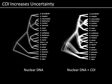
When I first started doing science, visualization of our data and results was a bit easier. Sequence a gene from 20-30 individuals, generate a phylogenetic hypothesis, make it look pretty, Figure 1. As we have moved to information from more and more loci (or greater numbers of samples, or any other factor of additional complexity), there have been ways developed to summarize the results visually for the purposes of proving to the audience of a journal article that you are on the right track in terms of interpretation. For example, former postdoc (and now faculty at Texas A&M - Galveston) Ron Eytan used these images to show which parts of a phylogeny were consistently supported and which were not (an image that overlays many reconstructions of a phylogeny from the same data):
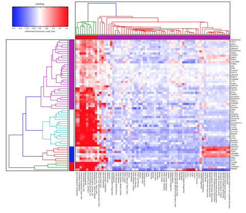
and we are now becoming familiar with things like transcriptome heat maps to illustrate over/under expression of particular genes:
and to an extent, we have just become accustomed to more complicated representations of data and results residing only as online supplemental files. In other words, often the most important components of science are no longer able to be represented in the standard peer-reviewed journal article. We are at this point often having to take into consideration representation of science through multiple filters: how will it communicate to the audience? what if that audience is looking only at a photocopy, or black-and-white print of my article? what if that audience is unable to afford the journal I submit to?
but what I’m grappling with today, is what if there is no single view, even if it is a figure with multiple panels, that can explain your results the same way that having an animation, in particular an interactive animation, could do?
the above is a representation of fitting in silico particles (representing barnacle larvae) to a coastal oceanographic system with environmental selection on the two lineages of barnacle that we are studying. The bottom plot shows frequencies of the northern and southern types plotted against latitude, and as the movie plays it shows how the oceanography and selection interact to fit simulated data to empirical data. This alone is a daunting amount of information. But we can vary so many parameters: depth of larval release, time in the water column, strength of selection, cost functions, the fit to over 100 distinct loci for which we have data, inter annual variation. There is almost no way to represent the complexity of this story - adequately! - in the illustrations we typically put together for a science publication. So it will probably end up that many of these movies will be online supplements. But I wonder: when will our expectations of “publishing” science catch up with the technology with which we DO science?